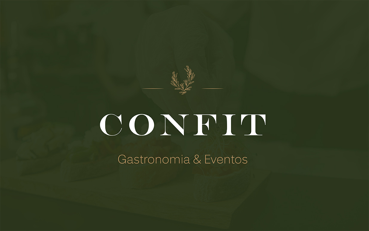
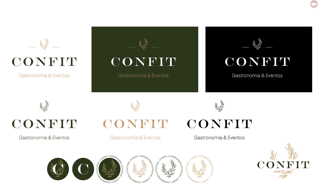
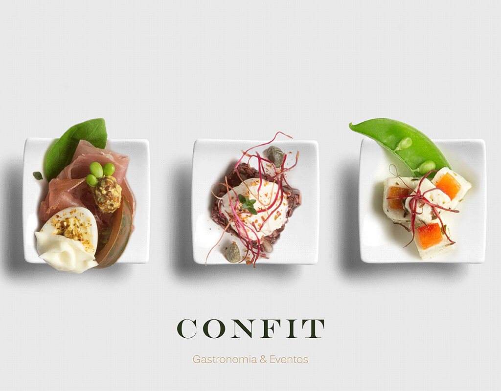
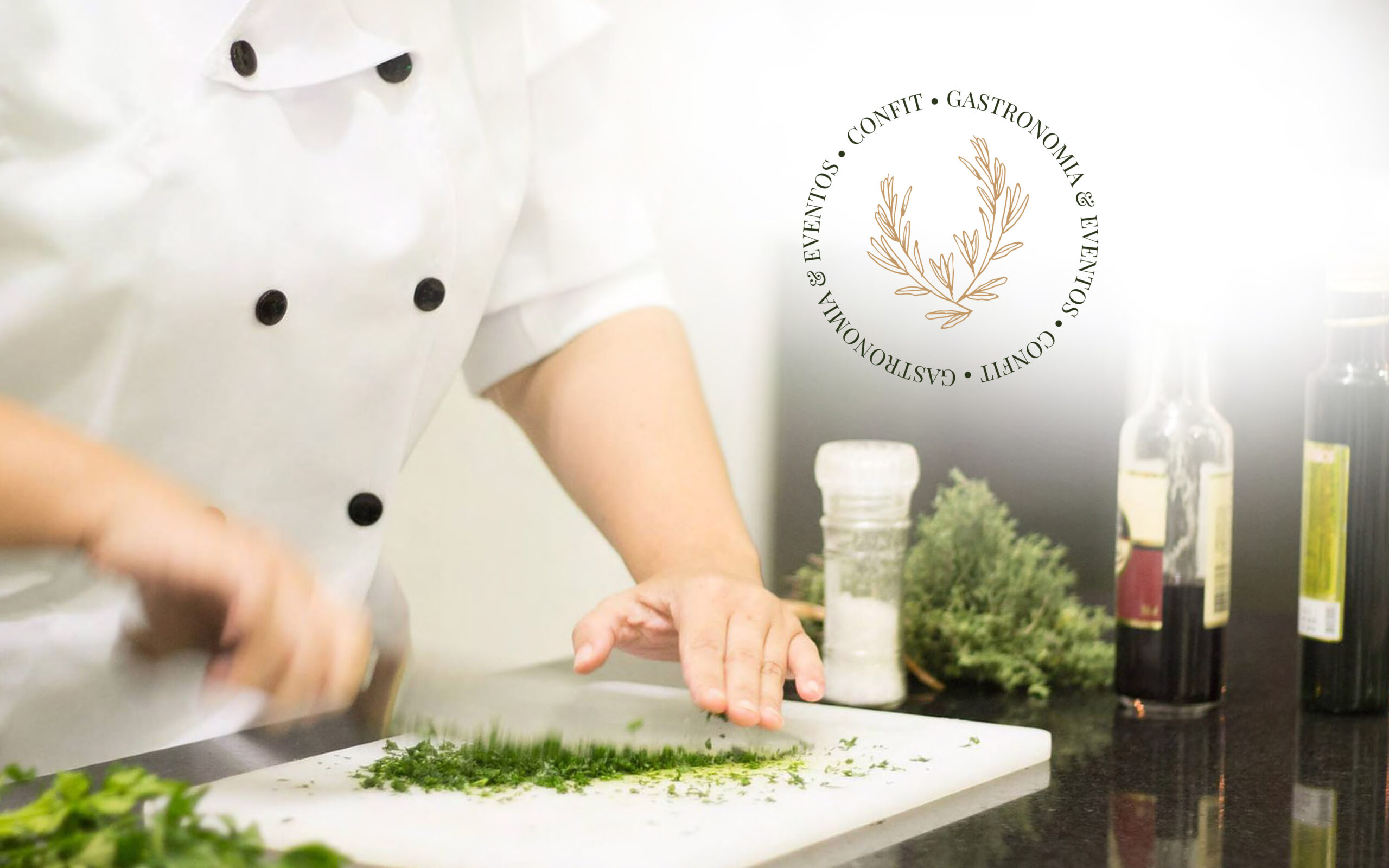
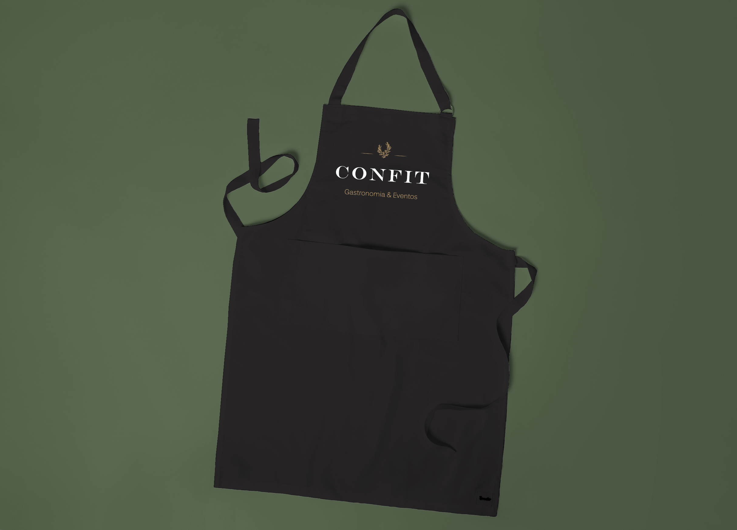
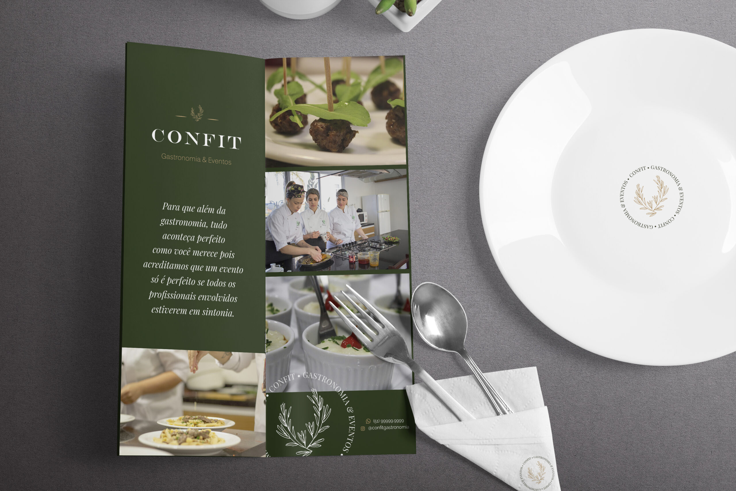
The brand’s goal is to convey to customers professionalism and competence in the field of gastronomy for events. To this end, a visual identity proposal was created containing a chromatic pattern with sober tones. The change in the shade of green to a darker tone gives seriousness to the brand, the main factor requested in the briefing. The serif typography brings the refinement that the brand needs, along with a simpler font for its decoder. Finally, the icon at the top represents thyme, a symbol already used in the company’s current logo.